Take a quick look at the job market for nurses and you’ll find it flooded with ads and approaches that all share the same mission-based, noble-profession tone. It makes sense. Nursing is a noble profession, but it’s also a very tough and very human profession.
So, in order to stand out in that sea of sameness and catch a nurse’s eye, we tried to make them feel seen. This campaign didn’t shy away from the hard parts of being a nurse. Instead, it reframed those struggles by communicating all the reasons this tough job is better at Vanderbilt.
Additional credits:
Designer - Giuseppe Lipari
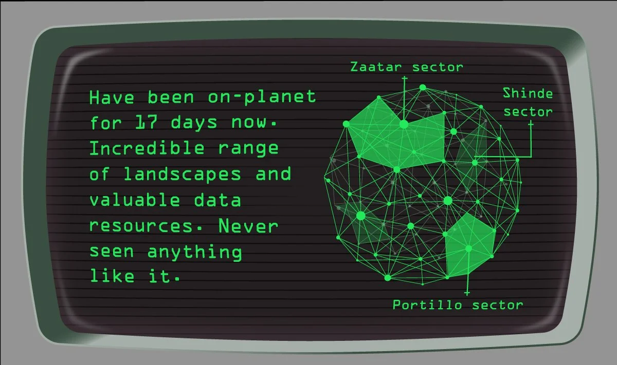
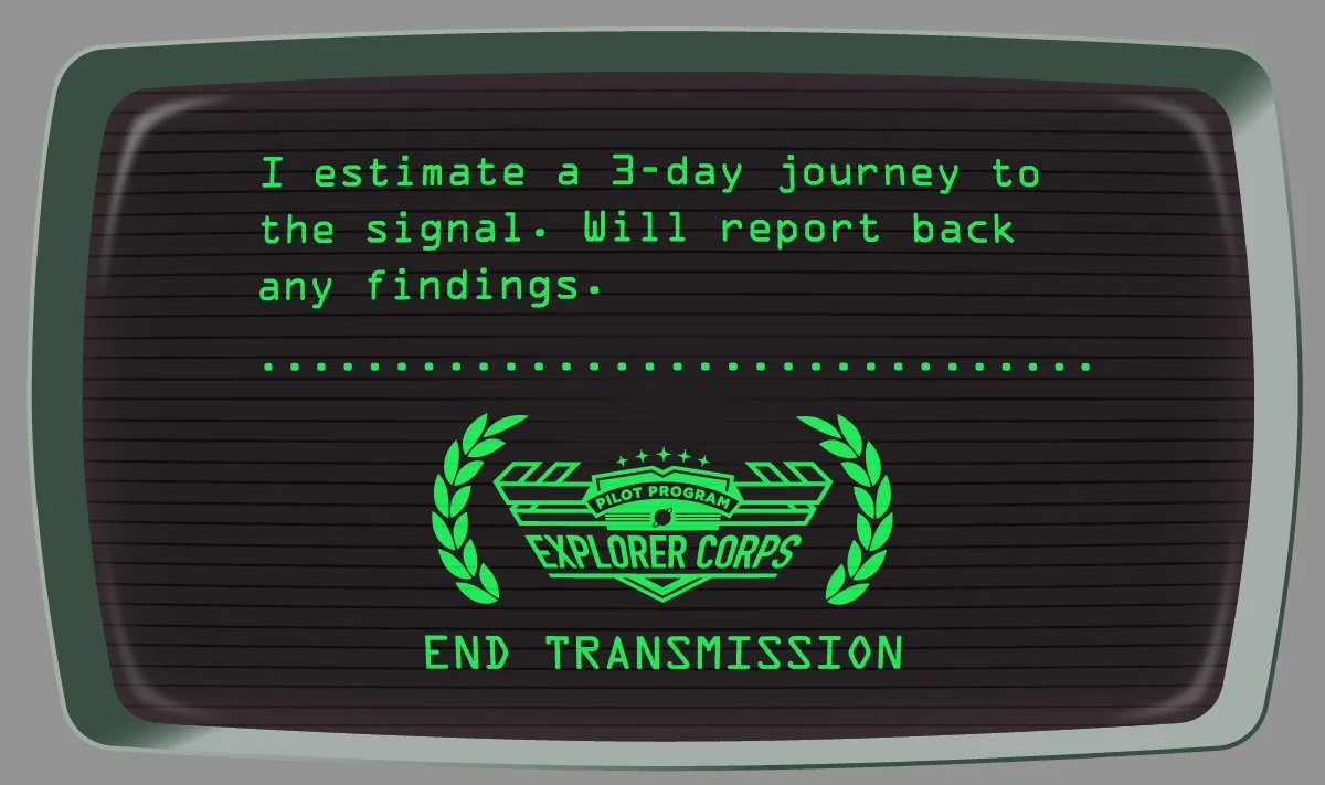
The biggest data company in the universe decided to make a big change in how they build their data centers; and they needed help getting the word out to their employees.
This campaign involved a lot of moving parts and a budget that demanded efficiency. This retro-futurist style allowed us to work light and fast. We created a series of videos and web stories to engage employees with an ongoing storyline (just your basic space saga about project management software).
Additional credits:
Creative Director - Vanessa Duff
Designer - Tyson Smith
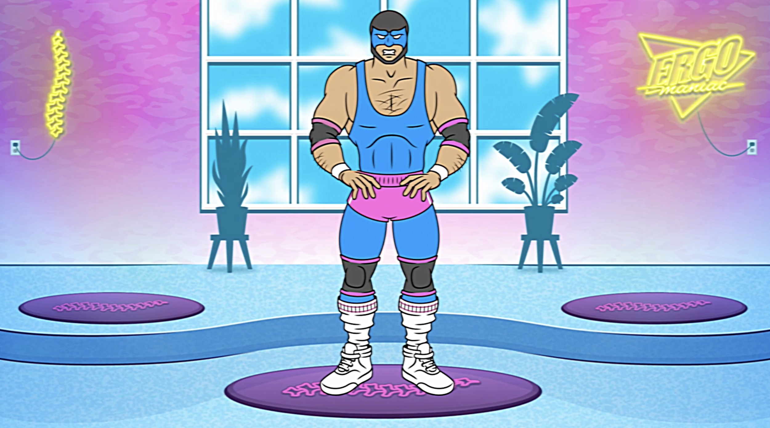
These pieces are part of a much larger health and safety campaign based around larger-than-life characters we created for a very large data company. I mean, we’re talking BIG (let’s just call this company Giggle).
Writing and directing this video definitely made me more aware of my tendency to hunch over the keyboard.
To create this ergonomic workout video for employee health and safety, we borrowed from the greats: Jane Fonda, Richard Simmons, Billy Blanks, and John Mayer. This campaign included posters and emails as well, all designed to get people paying more attention to their bodies throughout the workday.
Additional credits:
Illustration - Tim Stickrod
Animation - Keeley Davis
Home Ergonomics
This piece was a little something to show employees that Giggle hadn’t forgotten about the smaller folks in their lives. With so many parents and kids stuck at home doing online learning during COVID, Giggle wanted to offer its support with this guide to home ergonomics.
Additional credits:
Art Director - Vanessa Duff
Designer - Corey Shields
This client’s biggest safety issue was a seemingly simple one: employees weren’t wearing their gloves. Boring OSHA posters in the break room weren’t making a dent. So we decided to give them a campaign that would get attention (borrowing some style from Saul Bass). I wrote and directed the video after storyboarding with sticky notes, and we repurposed art assets for a poster series that went up onsite.
Additional credits:
Illustration - Demitri Powers
Animation - Keeley Davis
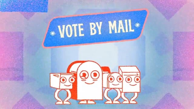
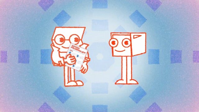
2020 was a helluva decade. And with an election going on, it seemed only right to help get out the vote. This social campaign borrowed a page from Schoolhouse Rock (obviously) and used friendly cartoon characters to spread important vote-from-home information. I even got to write a few songs.
Additional credits:
Art Director: Nikki Rodriguez
Creative Director: Giuseppe Lipari
Music: Jon Pontrello
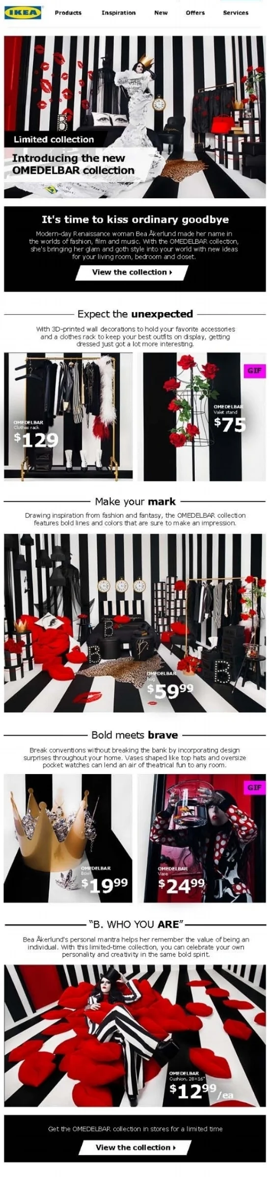
There can be a lot of juggling involved when dealing with big brands. And understanding how to work within the constraints of a brand's identity while pushing the envelope at the same time can be tricky. But when the biggest name in affordable Swedish furniture joins forces with the biggest name in Gaga-related style, they don't want to be subtle about it.
Additional Credits:
Art Director - Jen Hadley
ACD - Jen Betit
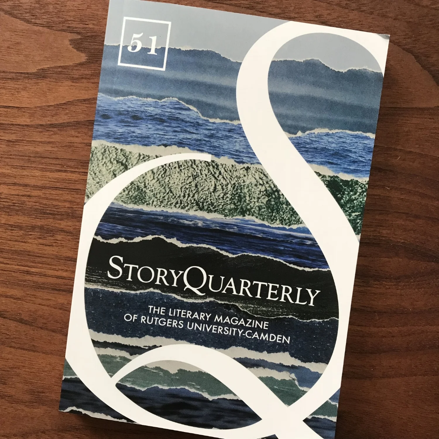
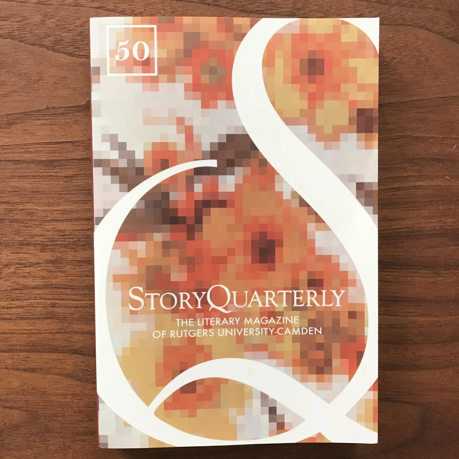
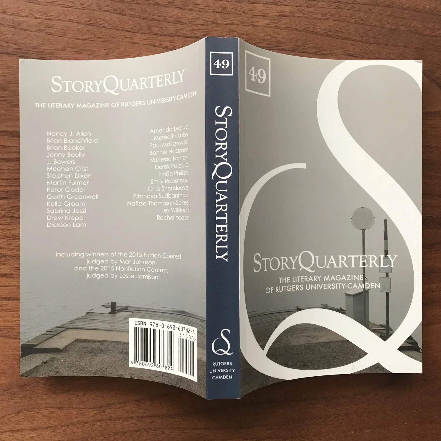
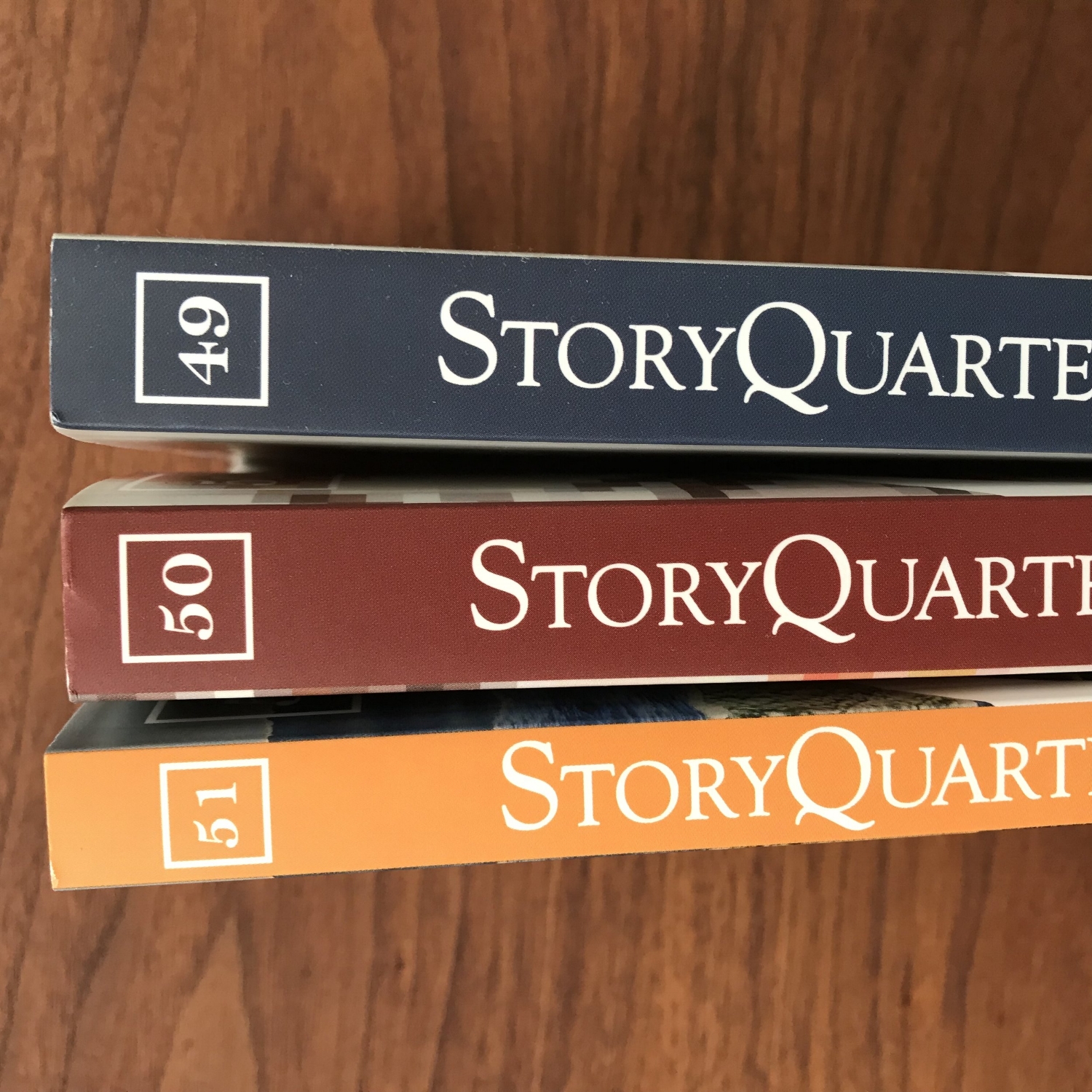
StoryQuarterly is a literary journal that's been around forever. And, full disclosure, I served as an associate editor at the journal for a few years during my MFA. They/we were in need of an updated look but wanted to maintain elements of the brand identity they had built up over the years. I created this cover design with the idea that it could remain consistent throughout subsequent issues with changing feature artwork (photos, paintings, etc).
#51 had several stories featuring the theme of water, so I ended up creating a sea of oceans by collaging torn strips of photos from a surf magazine.
#50 dealt with the digital world in one of its stories, giving me the idea to repurpose pixelation as a design element rather than something to be avoided.
#49 was the first year of the new redesign and it felt important to ease into the new look of the journal. I used a photo I’d taken while staying on a foggy island in the Stockholm archipelago as a wrap image and crossed my fingers that it wouldn’t spook any of the subscribers.
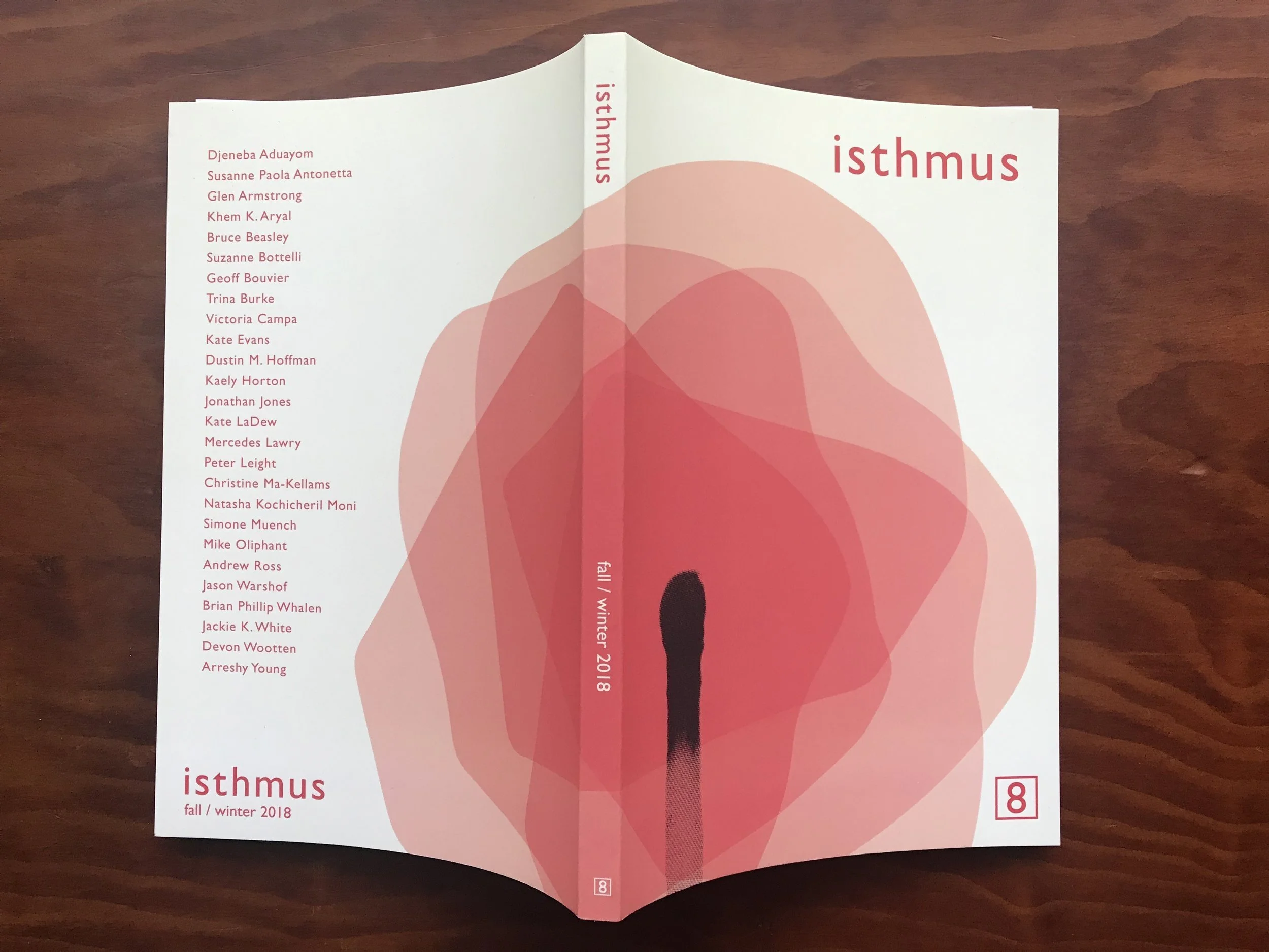
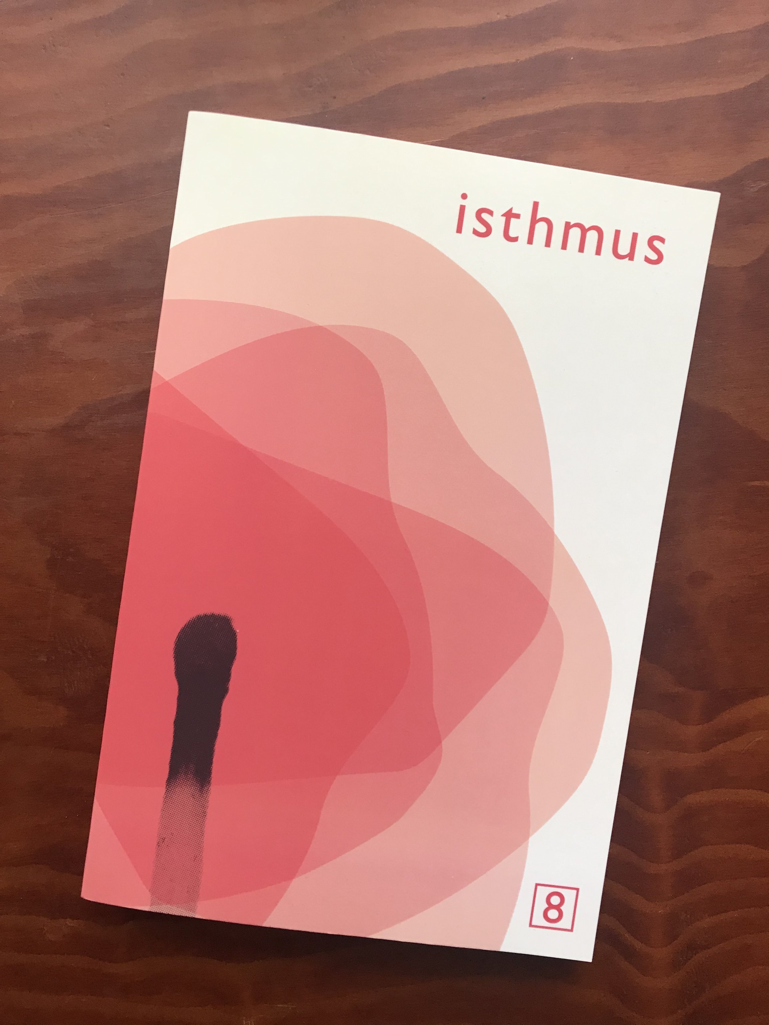
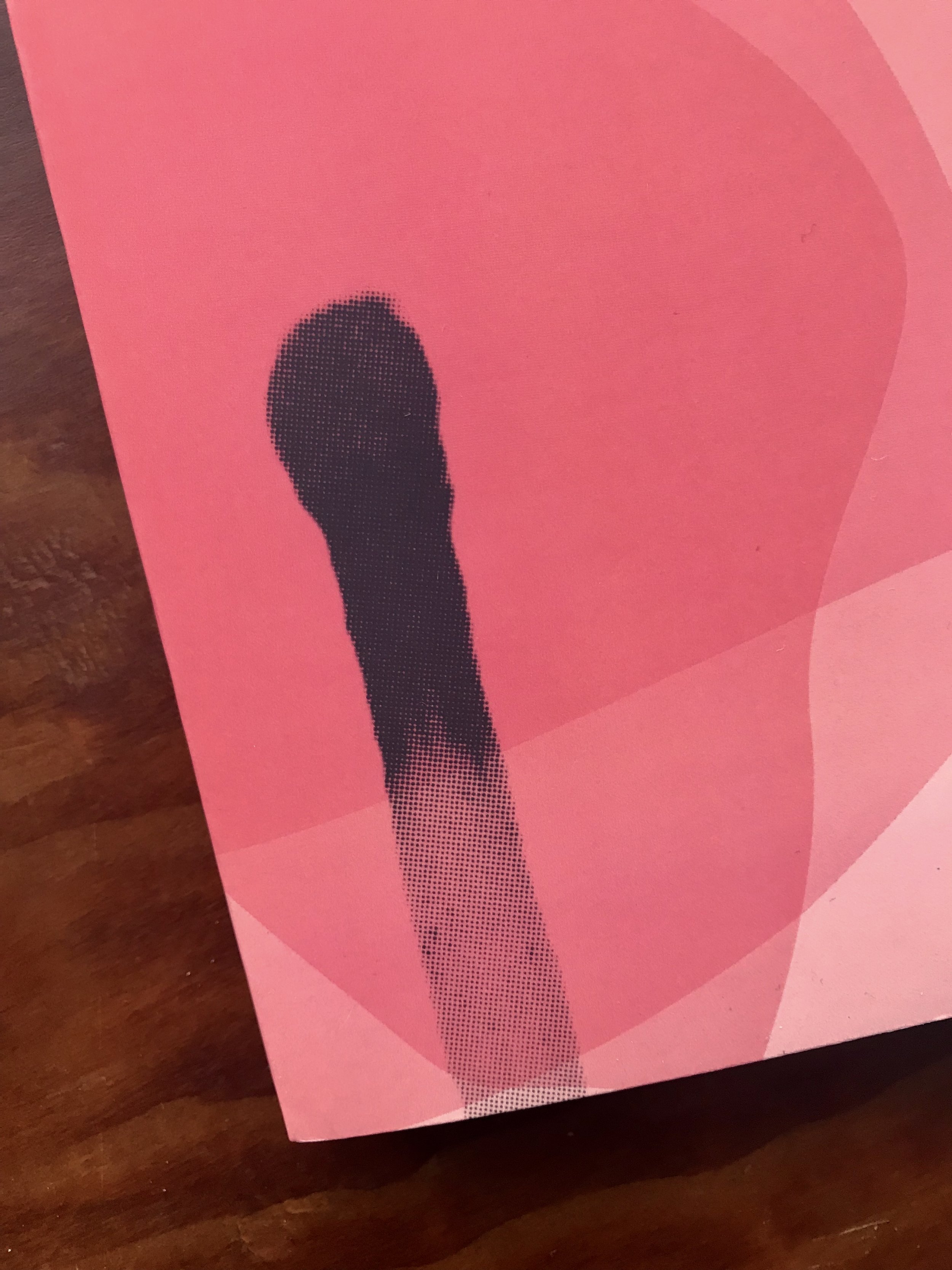
Isthmus asked me to design a cover for their eighth issue. After speaking with them about this issue’s submissions, I wanted to create something abstract and modern that still touched on the DIY nature of zine culture. I ended up halftoning my photo of a spent match and pairing it with this monochromatic flame/flower shape.